1. I chose my perspective blog post as the one that doesn’t show my ability to critique my artwork. I didn’t like how my final turned out which showed in my write-up of it. I didn’t use good art vocabulary and I only explained what went wrong in the piece, rather than things I did well and things I could improve on. I am going to critique my painting in the style of another artist correctly, to show that that first blog post doesn’t portray my abilities to explain my artwork. My painting is a tree in the style of Gustav Klimt. Klimt was a symbolist painter who took a special interest in gold and, back then, controversial topics. I was trying to capture Klimt’s symbolist style, so the tree is not at all realistic. It is supposed to look abstract. If someone who was familiar with Klimt’s work saw this painting, I think they would know it was inspired by him. I used many of the same features that Klimt used in his paintings like the massive amounts of gold and symbolism. Within the tree trunk, there is a variety of shapes including triangles, circles, squares and also some free-handed shapes. The biggest challenge I faced was mixing colors to get the shade I wanted. Having not used acrylic many times, it took a while for me to get the tree trunk and background colors just how I wanted them. While I was drawing the shapes in the trunk, I wanted them all to have a warm feeling to them, in color and shape. Having problems with mixing paint, I had to stray away from that idea. Instead of sticking with reds, oranges, and yellows, like I wanted, I made blues, greens, purples and other colors. Klimt didn’t use such bright, distinct colors in his work, which definitely sets mine apart from his. I would like to think my artwork creates a warm mood. The browns and golds remind me of warmth. Concluding with impressions, I think if someone who had no idea who Gustav Klimt was saw this, they would think it was strange. It’s definitely different and more abstract having shapes and symbols in the trunk, gold swirls rather than leaves and a gold background rather than a blue sky. Overall, I hope whoever saw this thought I did a good job portraying Gustav Klimt’s symbolist style.


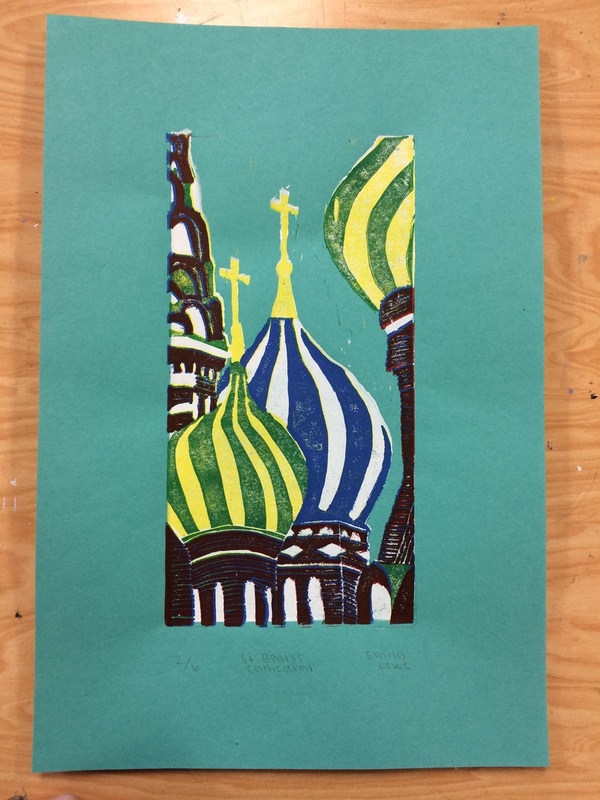
2. It might not be my most successful piece, but after looking over all the pieces I did, I would say the printmaking was my favorite. I had a fun time doing it and I think it turned out pretty well. The prompt was architectural wonders of the world. I didn’t want to do something like the Pyramids that many people would do, so I decided on St. Basil’s Cathedral in Russia. I liked the different aspects of the cathedral including the colors, shapes and sizes of the domes and buildings. Choosing the colors was pretty easy considering the building had already picked out the green, yellow, blue and white for me. I decided on using red rather than brown for the brick because I wanted to keep the print bright. After finishing the print, I do think the red looks much better than a brown would. There were a lot of details I had to take out. After printing the white, I decided on leaving the bricks as just lines instead of trying to cut out every individual line to make the bricks. I don’t think that decision took away from the final. It made my life a lot easier. Lining up the colors with the bricks was definitely the hardest part so imagining trying to line up little boxes sounds awful. My technique of laying down the linoleum and flipping the paper was definitely the right call. It was stressful flipping the paper and linoleum over but it lined up much nicer this way. This project was a wild card for me- I didn’t know if it would turn out good or awful but I’m pretty happy with the final prints.
3. Choosing a medium for the up close nature project was tough for me since we were given so many options with watercolor, colored pencils, chalk pastels, etc. I liked the oil pastels when we were drawing spheres and adding values. Once we did the cans, however, I realized that oil pastels wouldn’t be a good medium to use considering I was doing a shell and I wanted a medium that flowed more. I already sort of knew in the back of my mind that I wanted to do watercolor. We did the watercolor apples and I’m so glad I did because I realized that creating a gradient was much harder than I expected. When I was planning out my shell, I knew I wanted the inner part of the section to be a darker red and eventually fade to a yellow. I tried to do that with watercolor but it didn’t look like I wanted. When I finally tried the watercolor pencils, I could control how much color was being shown which ultimately made me decide to use the watercolor pencils on my shell.


